Steel Frame

Chicago Window


Steel Frame

Chicago Window
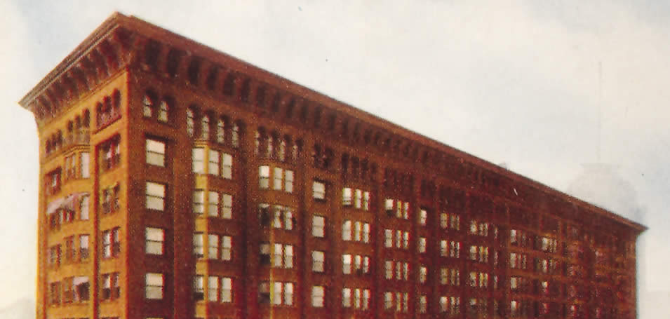
For the first time, architects had to consider what a tall building should look like. Early designs emphasized the horizontal, mixing styles on the façade to minimize the height. Chicago School buildings emphasized the vertical, creating a unified whole by dividing the façade like a column. The lower section is the weighty base. The middle section is the shaft with long vertical lines drawing the eye to the top section. The capital—cornice—usually featured a classical decorative scheme. The Marquette Building’s “capital” is in three parts: two small cornices on the 15th and 16th floors and the large cornice at the 17th floor.