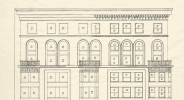

Original Concept Elevation

Allocation of Space


Original Concept Elevation

Allocation of Space
About the image
The Light Well. Photo by Tricia Koning.
Continuous light access saved money on electricity and gas and promoted a healthier environment. Air flow was as important in a time when air conditioning and air handling systems were not standard.
The Chicago window offered a perfect solution. Most of the Marquette Building’s windows featured a divided central pane—perhaps to allow for flexible division of interior space. The flanking windows could open to control air flow.
The building’s floor plan promoted light and air circulation. Shaped approximately like a capital E, an open court clad in white enameled brick bounced light into the offices. These features assured that every office—interior and exterior—had maximum exposure to light.
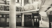
The building’s 11 elevators were situated along the octagonal portion of the E. The elevators also had windows on the light well. Their open grills allowed natural light into the lobby.